


This project was completed last autumn. A small, local company making dairy products, requested a radical change in design labels of cheese products. The brief stated that the company produces high-quality cheeses based on original Dutch and Italian recipes using natural cow and buffalo milk without using vegetable fats. Due to the use of natural ingredients, the products had a higher price, and compared to imported brands, they had a completely unattractive design. As a result, the products were losing out to low-quality dairy products made from vegetable fats but with a bright, recognizable appearance.

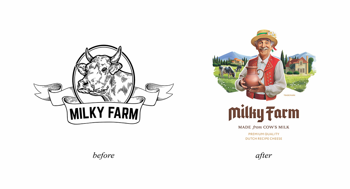
It was obvious that the logo and label were created by a designer without specialized education and experience. Essentially, it was clip art with the brand name added to it. Even the brand name itself could hardly be called original. In developing countries, it is fashionable to name brands using simple English words.

While communicating, it became clear that the client found me through Behance. He was attracted to my style of creating complex, combined logos. The main requirement was to update the logo in this style.
After determining the client's preferences, I started gathering information. As before, I asked for help from artificial intelligence for ideas on creating the look, color scheme, and features of the face. AI is a unique and indispensable tool in this regard. However, it's important to recognize its limitations because it's not actual intelligence and cannot complete the work for you.

AI cannot create clothing details for you, especially when it comes to national costumes. It can't properly position limbs, understand how to arrange objects, or create the right composition. The drawings below vividly demonstrate the limited capabilities of AI. Therefore, a human will still perform a significant (if not primary) part of the work.

The products were made according to the classic recipes of European countries. Considering this, the client wanted the character to look European and the background to resemble European landscapes. In searching for materials, Swiss national costumes caught my attention the most.

On the "D-day," I started working. It was the client's first experience working with a professional. Typically, clients find it very difficult to make choices in such cases. So, I decided to create 4 different options right away. It took me more time at the sketching stage, but I was confident that the client would be able to choose the optimal option on the first attempt.

While creating unique logos, typography is no less significant. Handwritten lettering has a more unique shape, and more importantly, it integrates better into the environment; it's easier to "blend" with the main part of the logo.

Four illustration options and three typography options allowed me to create 9 different logo variations. With such a portfolio, I decided to conduct the first stage of the presentation. The goal of this stage was to determine the direction and narrow down the scope of work.


The virtual presentation was successful, and two days later, the client informed me of the chosen option.


Choosing typography turned out to be somewhat more difficult, so I refined two options before the final version.

general appearance of the logo

Overall, the logo seemed to be completed, and I could move on to designing the label itself. However, the client had doubts about the background. Unfortunately, not everyone understands the uniqueness of engraved illustrations. So, I decided to redraw the background in full-colour raster graphics.
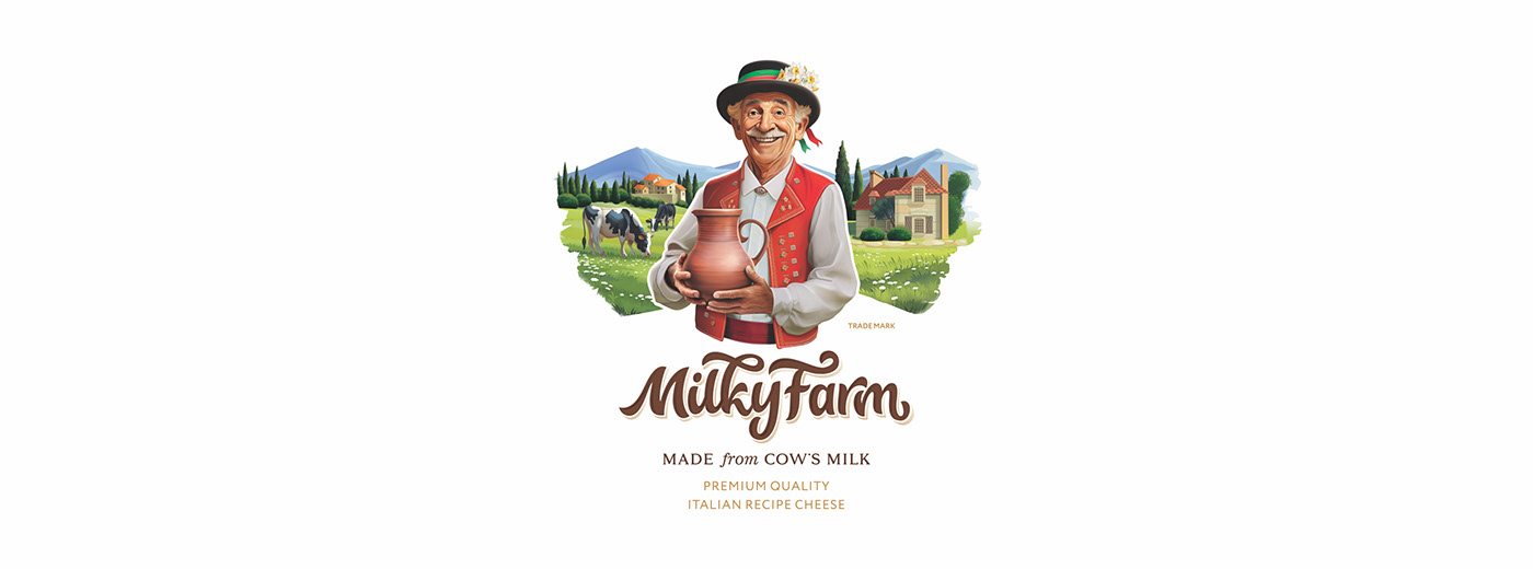
It seemed like the end, but the background illustration made the overall look somewhat dark. The client wouldn't notice such details, but for me, it was an unforgivable mistake. So, I drew a new hat for the farmer.

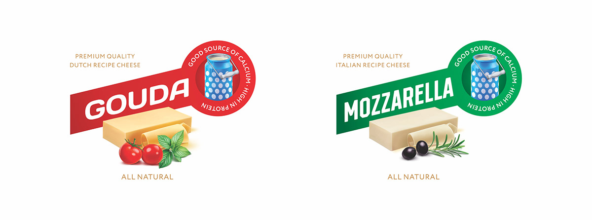
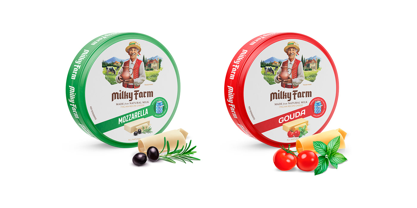
As I mentioned earlier, the logo is not the only work; you need to create a label, and one logo cannot fill the entire space. The manufacturer had several types of cheese, and I needed to demonstrate these differences while maintaining a certain sequence. Consumers should understand that although the products are different, they belong to one brand.
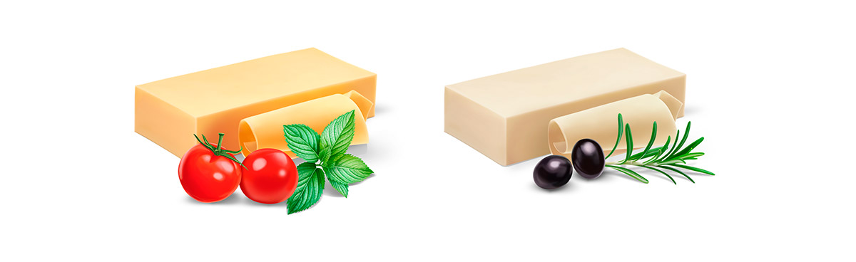
By creating a unified style, I also achieved a contrasting difference. Due to this, consumers could easily distinguish between different types of cheese from a distance of several meters.
Just two weeks later, the project was nearing completion, and the new labels were demonstrated to the client. I promised the client that I would create a brand for him with the most premium appearance, overshadowing all renowned brands. Fifteen days ago, my promise brought a smile to his face.

The means of this client were severely limited, and all he could afford was to update the product labels. But sometimes, even this small step for a designer is a huge leap for a small company.
Representatives of small businesses around the world face similar problems. They cannot compete with major brands, partly because of the unremarkable design of their products. And without the necessary budget, they cannot afford to invest in marketing, advertising, and design. My name is Rahib, and I have been involved in consumer branding for decades. I create unique designs from scratch, and every detail is my original work. If you like my work style, feel free to contact me, and perhaps your brand will be my next project.


